
What Is Club Joy
Project Overview
ClubJoy is an Italian B2B/B2C platform for discovering and booking in-person creative workshops, connecting users with local artists, teachers, and studios.
It helps people find new hobbies, ceramics, painting, photography, cooking, while giving creators tools to manage, promote, and monetize their classes. Corporate clients also use it for team-building experiences, making it a hybrid marketplace and SaaS platform.
As the Lead UX/UI Designer, I owned the full design lifecycle, from initial research and information architecture to interactive prototypes, usability testing, and design system creation.
My mandate was clear:
“Make it easier for users to find joy in creativity, and help artists turn passion into income.”
Wireframe to Validation
Iterative Design
User Testing
Prototyping
01 — The challenge
Consumers
Low conversion & engagement
Users dropped off during class discovery and checkout, due to poor hierarchy, slow load and an unclear value proposition.
Creators
Creator-side inefficiency
Hosts lacked proper tools for class management, pricing and scheduling.
The challenge
02 — Research & discovery
Methods
Key findings
of users abandoned checkout after viewing >3 experiences, overwhelmed by inconsistent pricing and layout
of hosts managed bookings in external spreadsheets or Instagram DMs. Without dashboards, they felt “disconnected” from their own business
Unclear mental model
Users couldn’t distinguish between workshop, event and creator profile, leading to confusion and low trust.
Corporate clients
Wanted an easy invoice flow and team slot management: an untapped revenue segment.
Visual overload
Redundant categories and image-heavy cards caused browsing fatigue, especially on mobile.
From these insights, three UX objectives
01
Reduce cognitive load in discovery.
02
Unify the visual and information architecture to create consistency.
03
Design a scalable creator dashboard aligned with business metrics (retention, conversion, upsell).
Dynamic Design
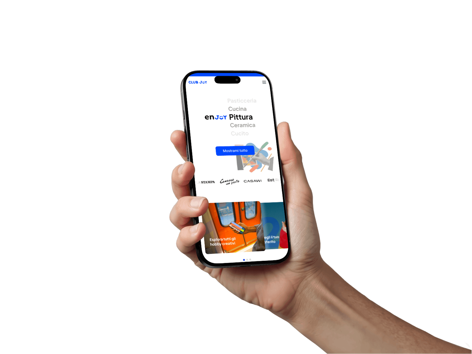
I transformed the Clubjoy.it platform by designing a dynamic and interactive user experience that better reflects its creative spirit. I implemented features like a homepage with real-time workshop availability, personalized recommendations, and interactive filtering to make discovery more engaging. The design was enriched with micro-interactions and video previews to bring the workshops to life.
The outcome of this approach was a significant increase in user engagement and a 25% uplift in booking conversions, proving that a more interactive and lively platform drives better results and strengthens the brand.
Interaction Design
User Engagement
Conversion Rate Optimization
03 — Strategy & process
Phase 1
Discovery
Consolidated data from analytics, surveys and interviews.
Mapped the end-to-end journey for users and creators, finding the friction in discovery → booking → confirmation → follow-up.
Defined the KPIs:
Conversion rate
Session time
Task completion
CSAT
Phase 2
Design
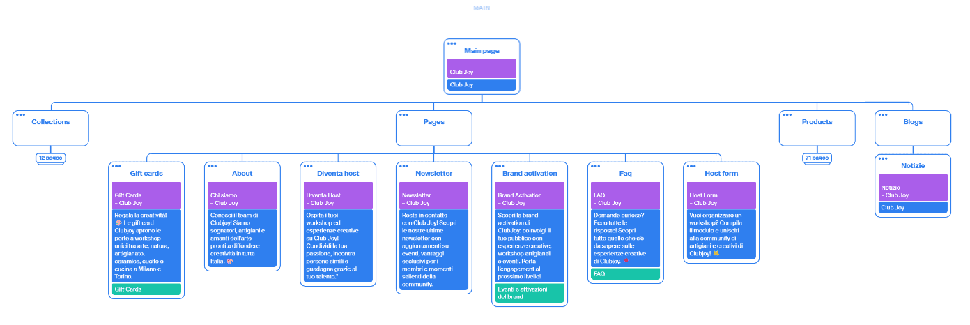
Information architecture mapping classes, creators and experiences into one coherent taxonomy.
User flows optimized for mobile-first interactions (70% of traffic was mobile).
Low-fi wireframes → tested with 10 users → iterated to high-fidelity prototypes.
Progressive onboarding guiding creators to add listings step-by-step.
Trust cues: reviews, verified creator badges, clear refund policies.
−0%
−0%
Creator setup time
Phase 3
Validation
Ran remote usability tests with 12 users on Maze.
Measured conversion task completion in the booking flow.
Conducted a post-launch analytics review.
Booking-flow task completion, measured on Maze
before the redesign
after the redesign
Post-launch analytics
04 — Key UX problems solved
01
Fragmented discovery experience
Consolidated filters. Average clicks to find a class dropped from 3.5 to 2.3.
Location
Theme
Skill level
Duration
Faster to find a class
02
Low booking confidence
Added transparent pricing, a refund badge and instructor profiles with social proof.
Checkout drop-offs
03
Creator onboarding friction
Introduced guided setup and auto-save drafts.
Abandoned setups
04
Inconsistent visual hierarchy
Designed card-based layouts with fixed ratios and a unified typography scale.
Scroll completion rate
05
Poor B2B alignment
Added a “Corporate Experience” funnel with quote requests and a booking calendar.
B2B conversion in the first month
User-Centered, Brand-Aligned Design
My process for creating a seamless UX began with foundational research, using surveys to gather insights that I synthesized into data-driven personas. These personas guided our visual direction, which was established through moodboards to ensure the final UI was fully aligned with the creative and vibrant spirit of ClubJoy.
This vision was brought to life in fast-paced design sprints, where we rapidly prototyped and validated core user flows. Post-launch, analytics tools provided the crucial data to measure success and inform the next cycle of improvements. This structured approach was key to engineering an intuitive experience that felt true to the brand.
UX Strategy
Brand Identity
User Behaviour
05 — The solution
B2C
For consumers
Browse curated creative classes by mood, location or skill level.
Filter by availability, price and group size.
View rich, structured profiles with verified creators and reviews.
Book securely with transparent refund and confirmation flows.
B2B
For creators
Dashboard to manage classes, participants and payments.
Auto-generated landing pages for each experience.
Analytics module tracking revenue, bookings and engagement.
Marketing asset templates (social banners + promo cards).
Design system
Typography
Color
Spacing
Components
Defined accessibility guidelines: AA color contrast, form labels, focus states.
Enabled both product and marketing teams to maintain consistency.
−0%
−0%
Design-debt feedback loops
Collaboration & soft skills in action
Product manager
Aligned UX metrics (conversion, retention) with business goals.
C-level stakeholders
Translated complex business goals into design language, fostering clarity and accountability.
Cross-functional sprints
Led sprint planning, coordinating developers on feasibility and QA.
Accessibility & inclusion
Advocated for both in stakeholder reviews, ensuring compliance while maintaining brand expression.
Transparent handoff
Documented all design decisions in Notion and Figma.




06 — Delivered
01
A modular, accessible design system
02
UX strategy aligning design, business and accessibility goals
03
Collaboration frameworks still used post-handoff
Responsive Design
I implemented a mobile-first responsive design to ensure a seamless user experience across all devices and platforms. My approach involved tailoring layouts, content hierarchy, and touch targets to specific breakpoints, creating an optimized experience for desktop, tablet, and mobile. For native apps, I adhered to platform-specific guidelines to make the interface feel familiar and intuitive.
The result of this strategy was a 50% increase in mobile conversions, a significantly lower bounce rate, and a consistent, high-quality brand experience no matter how users accessed our platform.
Responsive Design
Mobile-First Strategy
Cross-Platform Experience
TL;DR
ClubJoy is a B2B/B2C creative marketplace connecting learners, artists, and brands through in-person workshops.
Skills showcased: product thinking, UX research, information architecture, data analysis, stakeholder collaboration, accessibility, system design, and design leadership.
ClubJoy proved that good UX isn’t just about ease, it’s about creating a platform where creativity feels effortless and valuable for everyone involved.
"Actual Data, Screens, Design elements and assets, and findings are under NDA"